My Machine Learnt... Now What? - Part 3
The previous part looked at the ROC approach to binarize scores while minimising expected risk. The only constraints we have put on scores is that higher values mean higher probability for the target class. Sometimes, however, we need scores to be calibrated, i.e. to tell us something about the likelihood of occurrence of the target event.
As with raw outputs, calibrated scores need to be evaluated on a separate data sample before launching a system in the wild. Here again, our objective is to minimise the system’s expected risk. This final instalment builds on common concepts developed by the statistical learning community - see the previous parts for more details.
By “evaluation of a predictive system”, what I mean is answering questions to determine what and how I should deploy it:
- What is the expected risk of my calibrated system?
- How does it compare with a majority vote approach
- What calibrated system outperforms others on a range of application types? What about all possible application types?
There is a large and fragmented range of evaluation tools to address the points above, and we will review one popular example, however, NIST SRE has built a more unified approach.
We start by looking at a few scenarios that require score calibration, then we will review two types of score calibration: as probabilities and as log-likelihood ratios (llr). The last section introduces the NIST SRE application-independent methodology via the Applied Probability of Error (APE) graph.
A note on external sources and the code used for this blog - the NIST SRE literature referred to in this blog is listed at the end. The source code used to generate all the examples is on my personal github repo. The financial fraud use case is based on the same data generating process detailed in Part 1. The main recognizer is based on SVM and the competing recognizer is based on Random Forests.
A. Why use calibrated scores
Calibrated scores immediately allow us to make Bayes decisions, whereas raw or uncalibrated scores require an extra step. For example, ROC threshold optimisation uses a separate evaluation dataset to slide through every operating point and a) grab the corresponding (Pmiss, Pfa) b) calculate the expected risk at that point and c) find the threshold associated with the risk-minimised operating point.
While there’s nothing wrong with that extra step, it can be inefficient compared to using calibrated scores in some scenarios, of which I can think of 3 (there are probably more).
The “Human in the Loop” System
Sometimes, hard predictions are not good enough, and the agent using the predictions needs scores that carry more information than simply “this is a negative class prediction”.
For example, a fraud detection system may involve human supervision when it is uncertain about an outcome. Uncertainty typically refers to a likelihood of incidence given by the score. The detection system may send transactions to human reviewers if their predicted incidence is between 30% and 50%, because at these levels the cost of miss still outweighs the cost of using expert labellers.
Human labellers can have access to more information than what is in the training dataset, which often leaves out valuable information for technical or legal reasons. For example, a human may review online social media profiles to check if a user has a real identity, or they could request access to a restricted PII database available on a case by case basis.
For more information about human decision-making based on classifier outputs, you can check out Frank Harrell’s blog, e.g. here.
Deployment with varying application types
Sometimes, predictive systems must be deployed in different contexts, i.e. with varying prevalence rates and/or error costs. Here, calibrated scores can help ease the deployment process.
If a bank that trialled a binary fraud detection system eventually finds that it saves money and safeguards its reputation, it would naturally roll it out in more contexts, e.g. in new regions. It makes sense then to avoid burdening the system with an extra step that optimises raw scores via a separate database of transactions. With calibrated scores, the systems can be managed centrally, and local entities just need to apply a threshold that depends on their application types.
Combining multiple subsystems
Systems that make decisions based on multiple subcomponent outputs may require calibrated predictions. The motivating example in the NIST SRE literature is identity detection using different systems each built on separate biometric data, e.g. fingerprints, face recognition or voice signals.
If all prediction outputs speak the same language - that of calibrated probabilities - they can be combined to form a decision such as “this person is who claim they are”.
Another example may be an autonomous vehicle that makes a decision to stop at a traffic light using calibrated signals from cameras, Lidars, radars, and other sensors.
B. Calibration as probabilities or log-likelihood ratios
Probability-like scores are bounded between 0 and 1 where the reference class is $\omega_1$. This type of calibrated scores are easy to evaluate using sample frequency and they are intuitive to end users like a fraud expert. If a transaction has a 60% chance of being fraudulent, they may think “it’s slightly more than that of flipping a coin” and given the high cost of a miss they will investigate. The decision process to investigate can be made more rigorously with Bayes procedure. Going back to equation 1.1, if we assume that $p(\omega_1)$ is known then the rule becomes
\[\text{Given x, choose} \begin{cases} \alpha_1 \text{if } \text{odds}(\omega_1) > \frac{\text{Cfa}}{\text{Cmiss}} \\ \alpha_0, & \text{otherwise} \end{cases}\]And so, if the cost of a miss is approximately 3 times greater than Cfa, the human labeler should lean towards the target class for any score $s_i$ approximately greater than 0.25 because $\text{odds}(\omega_1) > 0.33 => p(\omega_1 \vert x) > 0.25$.
Note that if $s_i$ is like $p(\omega_1 \vert x)$ then it’s proportional to $p(\omega_1)*p(x \vert \omega_1)$ and so, an assumption about the prevalence rate must be assumed and “hardcoded” in the system that outputs $s_i$. That’s OK if the prior incidence rate can be assumed fixed across future system deployments. However, it’s not great if the rate varies between different applications, in which case llr-like scores would be better.
What are the implications of miscalibrated scores for expected risk? Traditional evaluation frameworks for goodness of calibration don’t provide a direct answer, but they give useful indications. The reliability diagram (RD) is a workhorse for calibration assessment. It shows the relation between scores and actual probabilities by binning scores (x-axis) and by calculating the target class frequency (y-axis). For the SVM (recognizer 1 below) and RandomForest (recognizer 2) it looks like this.
RD is a scatter plot, though we can imagine a line going through all the points, and compare it with the (y=x) line that corresponds to perfect calibration.
For both recognizers, scores below 0.7 lie below the diagonal and seem further away from actual probabilities than scores above 0.7. Values below the diagonal are called “overconfident” because they suggest that the probability of the target class is higher than what it actually is. Over and under-confidence can create additional risk by moving our predictions away from Bayes decisions, as the notional RD below emphasizes.
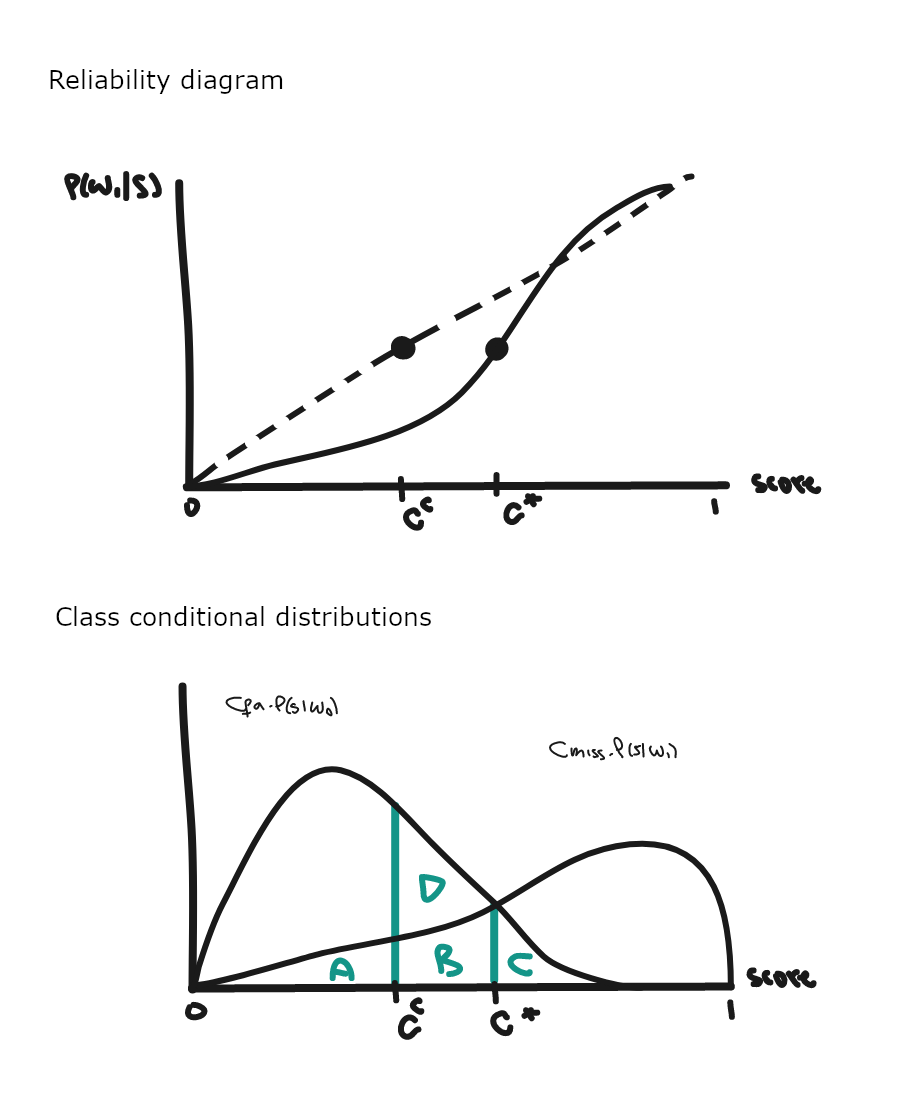
Let’s imagine an application type such that the optimal cut-off point is where $p(\omega_1 \vert s)=0.4$ which corresponds to s=c* on the RD above. A score of 0.4 corresponds to s=cc, which seems far away from the optimal threshold. How far and how bad is it in terms of expected risk is what we need to know to make an informed decision about using scores as probabilities or not.
Here, cc corresponds to a lower posterior probability because of overconfidence miscalibration, so cc lies below c*. Thus, using scores as probabilities, we will predict targets for any observation such that si > cc, including when si < c*, in which case this is not a Bayes decision, which would dictate to choose non-target.
The class conditional graph provides more details about what’s going on. Using equation 1.1, the Bayes procedures says that an instance should be predicted as $\omega_1$ if
\[\text{Cmiss}*p(\omega_1 \vert s) > \text{Cfa}*p(\omega_0 \vert s)\]i.e. for scores above c*. Then the decision is optimal and the corresponding risk, aka the irreducible error, corresponds to areas A, B and C. Poor calibration results in the additional risk area D.
Note that optimal thresholds located in calibrated regions of the diagram are still compatible with Bayes decisions. Hence, the region of miscalibration determines if we’ll pay extra risk, and that depends on the application types that we target.
How do we quantify that extra risk i.e. what price do we pay due to miscalibration? The answer requires an estimate of area D, which the next section addresses using the difference between the overall DCF and minDCF.
To sum everything up:
| Calibration error | Decision | Risk |
|---|---|---|
| No error / Perfectly calibrated | Bayes optimal | risk = A+B+C (irreducible error) ⇔ minDCF |
| Miscalibration | Non-optimal (non-Bayes) | risk = A+B+C+D ⇔ DCF |
The alternative to predicting scores calibrated as probabilities is to output llr-like scores. Then, the analysis is not tied to particular $p(\omega_1)$ and the cut-off point is $-\theta$ as derived in part 1.
How do we generate llr-like scores? The answer depends on the type of predictive system used, but logistic regression provides a simple, all-round solution for discriminative models. This tutorial describes the approach in detail, which I also tried for myself in this notebook using various assumptions about score distributions. Basically, logistic regression estimates the log-odds of $\omega_1$ and then we use Bayes’ formula to get the llr. As the examples in the notebook show, this approach works well when scores are approximately normally distributed.
By definition, logistic regression estimates the probability of target events assuming a linear relationship in the log-odds space:
\[\text{logit}(\omega_1;s) = \hat{y} = b_0 + b_1*s\]And using Bayes formula
\[\text{logit}(\omega_1;s) = \text{llr}(s) + \text{logit}(\omega_1)\]So for any raw score si,
\[\text{llr}(s_i) = \hat{y_i} - \text{logit}(\omega_1)\]i.e. we plug in the logistic regression prediction and subtract the sample prior log-odds (also called effective prior).
C. Evaluation of llr-like scores
The reliability diagram left us looking for the size of area D, which corresponds to the additional cost of making a decision using miscalibrated scores.
Applied Probability of Error (APE) and the related metrics, are evaluation tools for systems that output llr scores. They provide an estimate of the size of area D for all application types and other useful information, all on one graph, which supports go/no-go decisions and system selection (if there are multiple competing options).
Below is the APE plot for the reference system built with Recognizer 1, which is simply an SVM followed by a logit transform in an attempt to get LLR-like scores, using a separate evaluation sample. The dark red line is the expected performance of the system, aka the DCF. Given an application type located on the x-axis, the difference between DCF and minDCF is the cost of miscalibration.
Let’s look at each component in this graph.
Horizontal axis
An APE graph summarises performance across a large range of application types (x-axis). The 3 variables that define application types are squashed into one value, $\theta$, which is also the negative Bayes threshold, to represent application parameters in 1 dimension. It works because different application types correspond to the same Bayes thresholds. All examples below map to a threshold of c.0.916, so they are represented by the same value on the APE x-axis.
val app1 = AppParameters(0.2, 10, 1)
val app2 = AppParameters(0.5, 5, 2)
val app3 = AppParameters(0.71, 1, 1)
@ List(app1, app2, app3).map(getMinTheta).foreach(println)
0.916
0.916
0.916
The first application type resembles a fraud transaction scenario, where targets are rare events that cost 10 times more units when missed vs false alarms. With app2, we assume that targets are just as rare as non-targets, but now miss costs are only 2.5 times higher than false alarm costs. app3 is yet another version expressed as an error rate.
From equation 1.1, the key is that theta depends on the ratio between the cost-weighted prevalence probabilities. That ratio remains the same if we change prevalence and adjust error-costs accordingly, and vice versa.
The range of $\theta$ values shown on the graph depends on the application parameters that fit our case. In practice, a range of (-5 to 5) is wide enough because rare events often have Cmiss larger than Cfa, which prevents \(\frac{p(\omega_0)*Cfa}{p(\omega_1)*Cmiss}\) from reaching extreme values.
Vertical Axis - Dark Red Line
For every $\theta$ on the horizontal axis, an APE graph plots the expected error rate of the system under evaluation. The error-rate is the expected risk of the application normalised with Cmiss=Cfa=1.0, e.g. app3 above. It is also called the empirical Bayes error-rate.
We can still evaluate how our system would fare under non-normalised conditions because expected risks are the same up to a normalisation constant, which is \(\text{Cmiss}*p(\omega_1) + \text{Cfa}*p(\omega_0)\). That constant factor is our bridge to go from the normalised error to the scaled up expected risk at every threshold $\theta$. See the appendix for a proof.
Thanks to this constant relationship, any conclusions from comparing two systems on the APE graph still hold in the real (not normalised) world.
Vertical Axis - Other Lines
The other lines on the graph put the system’s DCF into perspective.
Minimum DCF - or minDCF - is the empirical Bayes error-rate of a perfectly calibrated system for every application type. The difference with the dark red line DCF is the error resulting from lack of calibration. The system is well calibrated if the two curves overlap for all thresholds. We typically track minDCF at the early stages of model development, when there’s still a lot of room to improve discrimination.
The Equal Error Rate is a scalar summary of discrimination power that corresponds to the worst case application type, i.e. $\theta$ with the largest minDCF. It’s a useful diagnostic metric - see the next example.
Majority-DCF is the empirical Bayes error-rate of the majority classifier, i.e. one that chooses the majority class every time. We should be worried if the DCF and majority-DCF overlap on most application types, as our system is not better than flipping a coin - see previous part.
However, the gap between DCF and majority-DCF typically narrows from the centre out to the edges of the graph as with imbalanced datasets, the impact of the minority class on the total error rate becomes negligible, and so betting on the same outcome all the time starts making sense.
Simulations
With two or more systems, we probably want to select the best performer. The Cllr metric summarises DCF across all application types, but a visual inspection of the curves may lead to the same conclusion if one system’s DCF lies below the others’. The graph becomes an essential evaluation tool if we are interested in one value or a range of $\theta$ values. For example, system 1 outperforms system 2 between -1 and 1.
Both recognizers use default parameter values, which leaves some room for improvement, in particular for system 2 as its EER is larger. In a real deployment context, we would probably improve discrimination with hyperparameter tuning to bring EER down, and then we’d look to minimise the loss caused by miscalibration.
Finally, let’s simulate some data to verify the APE graph values. This type of reconciliation can be useful to check that I understand the framework and that the code implementation is correct.
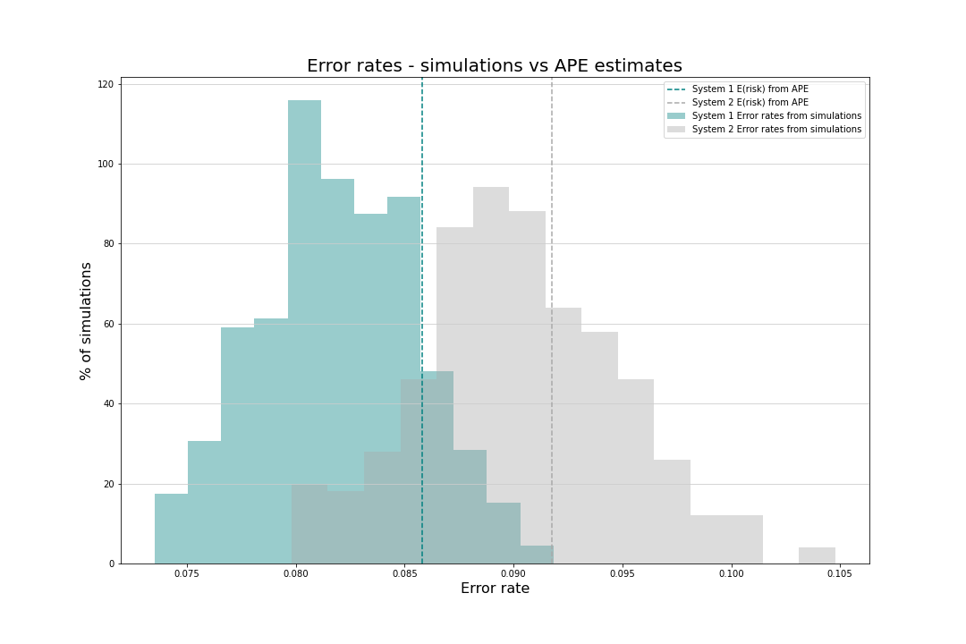
Assume that we plan to deploy a fraud detection system with AppParameters(0.3, 4.94, 1.0) i.e. an environment where fraud prevalence is high at 30% and Cmiss is c.5 times higher than Cfa. This corresponds to a threshold value of 0.75, where system 1 is the better performer - just hover over the chart to confirm that its expected error rate is c.0.088 vs 0.092 for the alternative. Should we launch system 1 and expect an error around 8.8% (or the equivalent unnormalised risk)?
Two hundred simulations confirm the insights from the APE curves, as the teal blue (system 1) distribution of error rates is located to the left of the light grey (system 2) distribution. The distributions are also roughly centred around the expected error rates from APE.
To generate experiments, we need to glue together 3 blocks: a recognizer, a logit transform and a thresholding function to binarize llr outputs:
      def getThresholder(cutOff: Double)(score: Double): User =
        if (score > cutOff) { Fraudster }
        else { Regular }

      val pa2 = AppParameters(0.3, 4.94, 1.0)
      val cutOff: Double = minusθ(pa2)
      def bayesThreshold1: Double => User = getThresholder(cutOff) _
      def system1: Array[Double] => User =
        recognizer andThen logit andThen bayesThreshold1
As with the risk simulation from part 1, I use probability_monad to generate experiments as one, large random variable that runs the full predictive process i.e. generate samples from the fraud DGP, run the system predictive pipeline and calculates the error-rate.
The random variable is defined in twoSystemErrorRates:
    /** Error rate simulations
      *
      * @param nRows the number of rows in the simulated dataset
      * @param pa the application type
      * @param randomVariable the transaction's data generation process
      * @param system1 a predictive pipeline that outputs the user type
      * @param system2 the alternative predictive pipeline
      */
    def twoSystemErrorRates(
        nRows: Integer,
        pa: AppParameters,
        randomVariable: Distribution[Transaction],
        system1: (Array[Double] => User),
        system2: (Array[Double] => User)
    ): Distribution[(Double, Double)] = // see details in code
System 1 is clearly the better option because its error rate was almost always (99.1%) below system 2:
val (berSystem1, berSystem2) = twoSystemErrorRates(5000, pa2, transact(pa2.p_w1), system1, system2).sample(200)
@ println(berSystem1.zip(berSystem2).filter{case (b1,b2) => b1<b2}.size / 200.0)
0.991
D. Conclusion
There are a few reasons to start using the NIST SRE application-independent approach - it is grounded in decision theory, it offers visuals tools like APE graphs, and it separates pattern recognition from expert decisions.
That last bit means that the decisions process can be split between pattern recognition followed by assumption-led hard decisions. A technical team develops a system that outputs llr’s, which subject-matter experts can combine with their best guess about the application parameters to issue a decision. Allowing this separation is a differentiating feature of the methodology, which I think played a role in establishing it in domains like forensics research.
The binary-class, fixed error cost assumptions may be too limited for some real world applications, though, so it would be interesting to adapt the framework to new hypotheses/constraints. For example, extending to multi-class decisions, or allowing error costs to vary with some attributes. The cost of a false alarm is probably higher for a large, once-in-a-lifetime purchase (e.g. buying a house) than it is for routine online shopping. To add one more item to the wish list, the likelihood $p(x \vert w_i)$ could also be allowed to change, as it often reduces the classifier’s utility after being deployed, and the framework should assess the impact of that change on expected risk.
Appendix
Constant link between error-rates and unnormalised risk
The normalised application type is an error-rate reparameterisation of our target application type with
\(\tilde{p(\omega_1)}=\frac{p(\omega_1)*\text{Cmiss}}{p(\omega_1)*\text{Cmiss}+p(\omega_0)*\text{Cfa}}\) and Cmiss=Cfa=1
The normalised application’s expected risk is then the same as the target application up to a constant:
\[E(\text{risk} | \tilde{p(\omega_1)}, 1, 1)=\tilde{p(\omega_1)}*Pmiss(\theta)+\tilde{p(\omega_0)}*Pfa(\theta)\] \[=\frac{p(\omega_1)*\text{Cmiss}}{\text{cst}}*Pmiss(\theta)+\frac{p(\omega_0)*\text{Cfa}}{\text{cst}}*Pfa(\theta)\] \[\frac{p(\omega_1)*\text{Cmiss}*Pmiss(\theta)+p(\omega_0)*\text{Cfa}*Pfa(\theta)}{\text{cst}}\]The last line implies that the Bayes threshold is unchanged under the reparameterisation:
\[\theta=\log(\frac{\tilde{p(\omega_1)}}{1-\tilde{p(\omega_1)}})=\log(\frac{\frac{p(\omega_1)*\text{Cmiss}}{\text{cst}}}{\frac{p(\omega_0)*\text{Cfa}}{\text{cst}}})=\log(\frac{p(\omega_1)*\text{Cmiss}}{p(\omega_0)*\text{Cfa}})\]And so
\[E(\text{risk} | \tilde{p(\omega_1)}, 1, 1)=\frac{E(\text{risk} | p(\omega_1), \text{Cmiss}, \text{Cfa})}{\text{cst}}\]NIST SRE papers used for this blog
- N. Brümmer et al (2021), Out of a Hundred Trials, How Many Errors does your Speaker Verifier Make?
- A. Nautsch (2019), Speaker Recognition in Unconstrained Environments
- N. Brümmer et al (2013), Likelihood-ratio Calibration Using Prior-Weighted Proper Scoring Rules
- N. Brümmer and E. de Villiers (2011), The BOSARIS Toolkit: Theory, Algorithm and Code for Surviving the New DCF
- N. Brümmer (2010), Measuring, Refining and Calibrating Speaker and Language Information Extracted from Speech
- D. A. van Leeuwen and N. Brümmer (2007), An Introduction to Application-Independent Evaluation of Speaker Recognition Systems
- N. Brümmer and J. du Preez (2006), Application-Independent Evaluation of Speaker Detection